Thursday 29 January 2009

Miro


I have brought a couple of books in for you Sarah. There are also some new Polish Books in the library that have arrived and have not been out on the shelves yet. Perhaps if you asked they would let you look? Here is Miro's take on the theme of 'Circus' there is a wonderful sense of space and drama.

Wednesday 28 January 2009

Gary P and 'Durutti Column' album Covers!


I have always been over fond of the work of Gary Prendergast! At last i'm finally informing you of it! Particularly his cut and paste technique, which is where the technique behind my illustrations emerged from. This first came about, when working with Gary for a while in the second year, when creating an artist book! After being informed of this technique, the project somehow fell into place, and I have only very recently been working with this cut and paste way of working, referenced within the 'Location brief'. I utilised this technique with a slightly different means of communication and became more computer reliant as opposed to Gary who maintains the aesthetic touch within his work. Yet I feel this way of working suits me best! I also had a quick peak at an influence that Gary P mentioned in his blog, (as you can see from the image below) and again fell in love with the work. This is a link featuring some of the music covers for the 'Durutti Column'. 


I spoke to Gary P, not too long ago about his work, discussing the issue that once these 3D juxtaposed creations were finished, how would you then generate them to become an Illustration, maintaining the aesthetic? This too, was a topic i discussed within my journal as the majority of illustrations are computer generated or rendered. After experimenting on the photocopier, which has now become a key element in my generation of work, darkening and lightening areas as much as I could so you can still visibly clarify that there has been a cut and paste technique used, I then scanned this in and cropped various areas, utilising photoshop tools to find the best outcome when overlapping the 'cut and paste' ephemera and the computer generated illustration.


Alvin Lustig


I can't remember how I came across these pieces, but it was whilst i was creating the cover jacket for the barcelona project that I was looking into Alvin Lustig. I think his use of space is complimentary. i love his use of shape and not always but his colours are quite striking too, but placement and use of space is something i'm still yet to crack and the size of objects, whether or not, they are too busy for an image, which is when i began to inform my work with shape. Referring to the self-initiated brief, the location brief, the shape element (i found) held my images together much better.
These Lustig pieces, particularly the bottom, exemplify the scale of some shapes and how they can aid a design (from my point of view). I love this piece, especially the placement of type, which i was again looking at for the barcelona project. having been already told that the type had a specific place, I was able to work around it with various means and media, the bottom piece of these Lustig Illustrations, for book cover jackets, aided that. Maybe you cant quite see the connection, but it inspired me!

Friday 2 January 2009

Barcelona: Book Cover and inner designs

Following on from the self-initiated brief, I followed the same practice, with the cut and paste technique, collected ephemera and photographs to create these mixed media juxtapositions. the cover over all works in a number of ways better than the other two. the type has been purposely integrated within the image and not simply just placed. The colour scheme is continued from that of the last brief, but working with one or two colours and their tones instead of an array of colours. The cover has been more considered in terms of placement and consideration of space, I like the incorporation of a silhoutte object or figure within my work  and also flat blocks of shape. being informed by illustrators such as Jim Flora. I was also looking into the work of Rodchenko from the constructivist movement. I admire his photography just as much as his photomontage, and the way he captured his subjects from alternate angles.

Technology/ Digital Craft by David Crow

After being informed of the new 'eye magazine' I began to read up on an issue that has been discussed by David Crow, which interested me and brought me to think of my own work, in relation to the way I work, with a 'hands on' approach instead of relying completely on the computer, but letting the handmade practice and efficency of this practice inform my work.

Crow discusses how the hand crafted design is a symbolic tool of the person, it depicts who they are.

"The hand is an important metaphorical signal for the presence of the individual in craft, and is central in the symbolism  surrounding the historic tension between man and machine , and more recently between global and local culture."

Arts and Crafts:

"If William Morris was the figurehead of the movement, the John Ruskin was it's inspiration: 'For it is not the material, but the absense of human endeavour, which makes the thing worthless' (Seven Lamps of Architecture, 1849). 
One lasting principle of the movement is the claim that art has a place outside the gallery; that art can be found in things that are useful. Industry was a 'beast without hands' that made dull and monotonous objects (and as Karl Marx later suggested, would do untold damage to the human experience). Hands were celebrated as capable of probing the world, bringing a unity of working and learning. No machine could replace the sensitivity of hands. Craft practice became synonymous with individualism and integrity."

"Craft is so often described as a practice surrounding a specific set of materials. But in truth it is less the material that defines the practice as the process of play, experiment, adjustment, individual judgement and the love of a material - any material."

Crow explores the ideals of craft, depicting it's importance to design, and not just a singular craft but in all areas ranging from textiles to graphic design. He talks about the aid of the computer beside craft and what design was like without the fundamental values of 'traditional crafts'.

A Vision In Colour:


Finally! Colour images! hurray! 
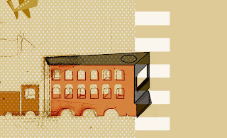
Im quite pleased with these, I treid to maintain the use of shape but at a more low key format to that of my train I had created earlier on for this brief, I found that as a singular image, it worked fine, but it was then a task of re- integrating it into the design, which became a problem. I stripped back the design and worked with a colour pallette I thought suited me. I feel I could add something more, a found object maybe, just to tweak the image, to give a more sense of 'me' as I feel there is a little something missing. The idea, was that these images were to be postcards but fit together, as a collection, again in the form of the mindmap, I have created a final image for this but it was not so successful as these prove to be on their own.

Mindmap

Mindmap:cut and Paste:

This image demonstrates the cut and paste technique I now use within most of my work but came across throughout my 'Location' brief. I quite often look into and admire the work of Hannah Hoch, a female dadaist who also demonstrated the cut and paste technique within her own work, only I utilise this technique from a different angle. the fact that you can see how I have created the mindmap, you can see where I have overlapped images, fixing them with sellotape in the corners. I like that you can see this, it gives the work more integrity. From this perspective my work differs from that of Hoch's, the dadaists were very neat on piecing images together, usually collected photographs and clippings. yet, as an image and not a complete image at that, I think it holds together well as a form, I still try to maintain that space and placement are quite important to my images.