Sunday 26 October 2008

Cheryl Taylor


Dear Cheryl,

I wonder If you remember me? I emailed you a few months back at the end of my second year. I am a student on the BA Hons at Stockport College, studying Illustration. My final year now! Firstly I would love to compliment your work again, it is always such an inspiration, I heard some of it is in the next volume of AOI! I know how busy you must be, I am currently in the process of writing my journal and you being one of my primary influences, I was just querying if I could have your opinion about a few things? I'll pop the questions in, if you get a moment, thats fantastic! thanks ever so much!

- You wrote a while back in one of your replies to an email, that you were inspired by Joseph Cornell, was it primarily his reference to birds, or were there other reasons?

- What do you do if you cannot get an idea to communicate in quite the right way? Or your general opinion on the communication of an Illustration, what you have learnt, being in the industry, working with other people?

- I am referring to the aesthetics of Illustration in my journal, as I am in the mix of a fine artist / Illustrator. Do you have any views upon the idea of hand made coming back, referring to Cornell or a general thought on the aesthetics of your work would be great.

Thanks ever so much, I hope to hear from you soon.

Sarah.

P.s, sorry about the two emails, i wasn't sure which email you were using, i hope one of these gets through.


________________________________________________


Dear Sarah,

Of course i remember you, how are you?

Well done in making it to year 3, you've done well in coping with the terrible twosome for that long (no offence Gary or Ian if you read this).

Okay answers...

I love the way Joseph Cornell used collage, the way he combined cut out found imagery, with objects that had been found and made, like the boxes he used to make to display his work. I find them really quite naive and beautiful, there is that element of the human touch and that somebody has cared enough about the work to create something wonderful for it to sit in.. I like his use of type also to you can see it is there but it doesn't rule the page. I also like the colours that he used... they seemed quite genuine. His birds were just a bonus i suppose. I think all in all i find his work genuine and sensitive... which are attributes that i admire in people.

One of the main things i have learnt is that you can't make things to complicated. Your work has to be beautiful and strong, and people have to understand it straight away. As people haven't got time to look and think about it. I feel they want to see something that is interesting and that they understand. When I first started out i used to make my ideas way too complicated but you learn through time to strip them down, this makes the work stronger. I used to really explain each idea in a huge paragraph when explaining it to the art director.... now its more like a sentence. Don't worry because this comes with time, and art directors understand, they work with people at all levels and if they like your work it's not an issue!

To be honest you never let it get to the stage where the idea is not communicating. Everything should be sketched in rough before you start on the main piece because if it's not working then it aint ever going to work, so you fnd an alternative route. Art is about beauty, illustration is about ideas, and other people have to understand the ideas too, so you have to keep it simple, punchy and beautiful like Ian's work.

I think hand made stuff is fantastic, and i think balance is also important. Imagen a plank of wood on a huge rock and it balancing in the middle. When new techniques start to emerge people follow the crowd, then the plank falls and everyone falls with it. But if you stay true to what your doing it'll all come good. Also i think it's good that you have a mix of fine art and illustration, as long as the idea communicates then why not!?

My work hmm this is the recipe for my work... mix a good idea, with a key colour pallette, add a good composition which the eye can follow the flow of, and see the relationships of the lost and found objects, add a sprinkle of humour and serve in warm bowl with a huge slice of sensitivity spread with love.

Is that okay?

p.s when you come to London with college, let me know and i'll meet you for a coffee and chat.

cheryl x

Figure Project - OWN WORK-


These are some examples for the figure project i created, the second of which, the head does not belong to me. I created two heads upon the first day of the brief, three days of which to complete the three sections in total. The yellow shape-like head initially came from an outline in correspondance to a russian doll that i was using within another project. I created the teapot in symbolism to the character head I had been sent, it reminded me of a dinner, so i thought hmm, food and drink. finally, my legs, i knew the shoes i was to be designing for the body, but i did not know how to fit the legs on. I feel this section, in contrast to my other pieces, doesn't hold as strong as it could have been, and i felt it was lacking a quality the teapot had. Possibly too many elements as one? Communication and choice, i find are the key elements i need to be aware of within my other illustrations.

Saturday 25 October 2008

Cristiana Couceiro


Have a look at Cristiana Couceiros work it seems to combine graphic shapes, textured/layered backgrounds and photography really well, added to this an intelligent use of space.

http://setediasete.blogspot.com/

Friday 24 October 2008

Mari Mahr


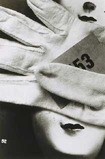
Mari Mahr is a photographer I have known of for a year or so, from the last post, this photographer informs my work by the means of overlaying a range of elements and materials. It was wrote that she usually photographs an image of choice and develops it and then overlays another object or element on top or in front of the previous photograph, and takes another picture, experimenting with scale, dimensions and communication.

- My Work - Map

From an earlier post, this is the work i produced reflecting the textile artist, Micheal Brennand-Wood, it is based around the idea of fantasy vs. reality. i've been creating a lot of work reflecting photography, although that's normally as far as it goes. As you can see the words intertwined within this piece, from a cut-up poem about reality in my own perception, the mixed media piece, worked better without those, I initially was going to weave small images into the piece depicting different areas or locations and photographing them in different ways, with focus for example, to depict either the fantasy vs. reality. 

Mary Blair

Mary Blair is a new influence over my recent work, Her adaption of shapes within her work fascinates me, with her use of colour. My work seems to be developing further more similar to this is practise, not so much technique, as i still remain to appreciate mixed media and the application of it, but in a similar way to Blair's work, I have been painting shapely illustrations and shapes but then scanning these in and working on them as a computer generated image. I'm currently trying to find a way of communication between subjective elements and techniques. Shape seems to be my new inspiration. 

Micheal Brennand-Wood


These two pieces were highly informative at the start of my self initiated project. This textile artist uses a strong combination of found materials, non-resistant and resistant materials such as wood and string. His use of colour fascinates me. Brennand-Wood works with a strong reflection of patterns and textures within his mixed media pieces. I happened to come across this book, by chance it had the same title as my brief - "You Are Here".

Rosie Flo's Colouring books!

I first came across a Rosie Flo book when I was at the Liverpool Tate for an exhibition, I found these in the gift shop an couldn't help myself but order more! I am eagerly drawn in by the hand-drawn elements combined with the photo etchings along side. Reflecting upon my work, when I include a drawing within a piece, it is always an outline, with same manner as these illustrations. 

Cheryl Taylor

Cheryl Taylor! Her combination of inquisitive photographic elements and her use of colours and space is a reflection of how I deem to work. I love everything about this image, because of the way she has altered the background image in colour and tone also reminds me of the suggested layering technique i was talking about within one of my earlier pieces. Her Illustrations sometimes seem to have quite a limited colour palette although her more upto date work is increasingly more vibrant. 

Bruno Munari

This image, from the book, 'Circus In The Mist', Is a layered creation by Bruno Munari. The book, primarily influenced an earlier brief, which I always try and reflect my work upon. I find working in layers, especially on materials such as tracing papers and accetates, a nice way of preserving my imagery, the same way Cornell did, with his curious boxes. Presently, my work consists of more photographic elements rather than collected ephemera but it still deems to inform me, whether or not it is reflected in a final piece.

Janet & Anne Grahame Johnstone

I adore this type of illustration, the colours especially! you can tell the time taken to produce each individual image. I quite often look at the imagery from this old nursery rhyme book, I was first reminded of it, a while back when i looked at the work of Cheryl Taylor, she had an image which was reminiscent of these typical, fanciful designs from the twin sisters. This illustration was produced in the 1950's when the sisters were in their prime, beautiful!

Sara Fanelli

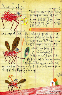
This is a piece which i regularly refer to, by Sara Fanelli, particularly for her use of chosen textures and placement of photographic elements. Her typeface throughout the book, 'Dear Diary' also appeals to me. I don't necessarily look into type as a primary influence of my work, but handwritten type really interest me. Her shapely manner of cut-out imagery really depicts the way I like to work, in a mixed media fashion.